Quick Customisation
Last updated: 2 minutes read.
Tyk Enterprise Developer Portal
If you are interested in getting access contact us at support@tyk.io
Introduction
In this section we will explain how to apply your branding (styling - CSS) on the portal elements with your own colours and logo within minutes.
Prerequisites
- A Tyk Self-Managed installation
- A login for the portal admin app
- Access to your Tyk portal file system
Step by step instructions
Part 1 - Changing the portal logo
- Access the file directory for the Developer portal
- The default logo is located in
/themes/default/assets/images/and is calleddev-portal-logo.svg. - Replace the default image with your own, keeping the same file name and in
.svgformat, ensuring thatxmlns="http://www.w3.org/2000/svg"is included within your<svg>tag.
Note
If you want to use different naming, path reference or extension, the code is <img src="/assets/images/dev-portal-logo.svg"> and is found on line 6 from the /themes/default/partials/footer.tmpl template.
Part 2 - Changing brand colours
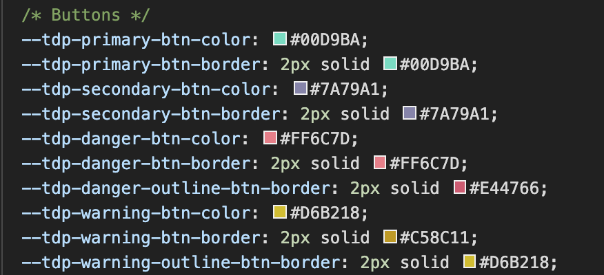
Let’s now explain how to manage borders and change the colors of buttons, texts and backgrounds. The file we’ll be looking at is /themes/default/assets/stylesheets/main.css which contains some CSS variables that are used throughout the app. Let’s take a closer look.
You can apply some changes in the portal based on your preferences. For example, you can change the navigation background colour, the text colour and the different button theme colours. Furthermore, you can change table border colour and radius.
If you want to change the navigation background colour you need to edit the variable called --tdp-nav-bg-color Similarly other variables as you can see where/how each one is used:
Note
tdp stands for Tyk Developer Portal
Background colours

--tdp-nav-bg-colornavigation background colour--tdp-body-bg-colorApp background colour
Text colours

--tdp-text-colordefault text colour--tdp-link-colorlinks (anchor tags)--tdp-nav-link-colornavigation links
Borders

--tdp-card-border-radiusCard component--tdp-border-color-on-errorinput color if there’s an error--tdp-table-border-colortable--tdp-border-radiusradius--tdp-primary-border formelements (such as<input>and<select>) if active--tdp-form-element-borderform elements (such as<input>and<select>)
Buttons
Buttons have four different concepts and each one of them has two or more variables:

Primary
--tdp-primary-btn-colorbackground colour--tdp-primary-btn-borderborder colour
Secondary
--tdp-secondary-btn-colorbackground colour--tdp-secondary-btn-borderborder colour
Danger
--tdp-danger-btn-colorbackground colour--tdp-danger-btn-borderborder colour--tdp-danger-outline-btn-borderborder colour of the outline variation
Warning
--tdp-warning-btn-colorbackground colour--tdp-warning-btn-borderborder colour--tdp-warning-outline-btn-borderborder colour of the outline variation